Why Windows 8 is So Annoying on Non-Tablet Computers
Windows 10 has been out since 2015. If you haven't upgraded yet, you should. It resolved everything we complained about in this article. But, we'll leave this article up for those who are stuck with a Windows 8 desktop or laptop, or anyone who has an academic interest in user interface design.
If you're not already familiar with the Start screen and the new-style full-screen apps of Windows 8 and how they significantly change your experience with a Windows-based desktop or laptop computer, please read the article about User Interface Changes in Microsoft Windows 8 before this one.
Transitioning to Windows 8 on a desktop or laptop computer is a jarring experience for those of us who are accustomed to the Microsoft Windows interface as it was for the prior 17 years. In this article, we'll articulate what's annoying about it, commiserate with you a bit, and then offer some tips for improving your experience.
So, here are the five annoying things about running Windows 8 on a non-tablet computer.
1. The Start screen is distracting and counterproductive.
Hitting the ![]() Start button, which popped up a small menu in the corner of the screen in previous versions of Windows, now makes everything you had on the screen disappear in order to display the new Start screen. Before Windows 8, if you had a bunch of windows open and you wanted to find something else on your computer, you could do it while keeping visibility of what you had open, whether it's a chat window, a video, an eBay auction counting down its final minutes, or even just a document you're reading. Losing sight of all that is disruptive to your train of thought. And if you're looking for something on your computer based on a tutorial you have open on a website, or some instructions you got in an e-mail, it's absurd in this day and age that you have to memorize it, and can't see the description of what you're looking for while you're looking for it!
Start button, which popped up a small menu in the corner of the screen in previous versions of Windows, now makes everything you had on the screen disappear in order to display the new Start screen. Before Windows 8, if you had a bunch of windows open and you wanted to find something else on your computer, you could do it while keeping visibility of what you had open, whether it's a chat window, a video, an eBay auction counting down its final minutes, or even just a document you're reading. Losing sight of all that is disruptive to your train of thought. And if you're looking for something on your computer based on a tutorial you have open on a website, or some instructions you got in an e-mail, it's absurd in this day and age that you have to memorize it, and can't see the description of what you're looking for while you're looking for it!
Also, the lack of a hierarchical arrangement of your program shortcuts reduces efficiency. The Start screen works if you have just a few apps on a tablet, but desktop applications often install several icons in the Start menu (the main program file, an uninstall icon, a help icon, etc.), and can put other related tools in submenus to make it easy for you to find what you need. Now, they're all in one group, until you fix it manually.
Sidebar: More about the Start screen vs. the Start menu (Skip)
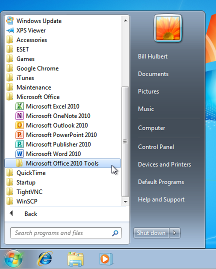
Here is a typical Windows 7 computer with several typical applications from 2012 installed. From the Start menu, you can access your Documents, Pictures, Music, the Computer icon (to get to a DVD or thumb drive), the Control Panel, and Printers on the right column, and browse through the hierarchical folders on the left to open programs. See how Google Chrome, Apple iTunes and QuickTime, TightVNC, WinSCP, and the anti-virus program by ESET are each represented by a single folder, regardless of how many separate shortcuts there are in each software package. There are also a few items you would see if you scrolled up (icons for Internet Explorer and Firefox, for example). And, you can see that the main programs of Microsoft Office are under one folder, which has been expanded here, while additional icons are tucked away in a subfolder (Microsoft Office 2010 Tools) that stays collapsed until you open it.
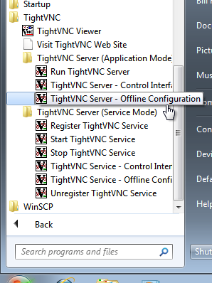
Here is what the TightVNC program groups look like, expanded, in Windows 7. The icons are neatly organized.
When you upgrade to Windows 8, you won't see any of that on the Start screen. You have to get to the "All Apps" screen to see your program icons, and this is what you will see:

(Click to view full-size)
To get to the "All Apps" screen from the Start screen using the mouse:
Windows 8
Right-click a blank area of the Start screen, then click
Windows 8.1
Click ![]() on the Start screen.
on the Start screen.
The first-level folders are now sorted with purple group headings, but everything is visible at once, and any subfolders are gone. The Microsoft Office Tools are mixed in, alphabetically, with the main applications in the Microsoft Office group. All the TightVNC control programs are mixed up. You can't even see the WinSCP icons, as they are off the screen to the right.
Microsoft has claimed that hardly anyone browses through the Start menu any more; most people pin the few programs they use to the Task Bar, which can still be done easily in Windows 8. So, at this point, you're expected to right-click the tiles you will use regularly, and select:
- Pin to Start, to copy the tile to the main Start screen
- Pin to taskbar, to copy the shortcut to the Task Bar on the desktop screen, or
- Open file location, which will switch you back to the desktop screen with a File Explorer window open and the selected shortcut highlighted; from there you can copy it to the Desktop if you like having your shortcuts there (make sure to copy and not move it, or it will disappear from the All Apps screen).
On the Start screen, you can arrange the icons into separate columns (called groups), and assign a title to each group. But, the flat grouping remains; you can't create subgroups. Also, you can't rearrange anything in the All Apps screen.
So, while you can improve the efficiency of the Start screen with a little work on a desktop or laptop computer, it still lacks the versatility of the Start menu. And, any time you do need to use it, there is no way to avoid having it take over your whole screen—that's something you'll just have to get used to.
![]()
Are you mocking me with that Start button?
One last note on this: Microsoft announced in 2013, before releasing the Windows 8.1 upgrade (free for users of Windows 8), that the Start button would be added back to the desktop screen. We all naturally assumed this meant the menu too, since the hierarchical submenus of the Start menu are all still there on the hard drive (just ignored by the Start screen). But, as if to slap us all in the face, Microsoft put the Start button there as promised, but it brings you right back to the Start screen! The return of the Start button in Windows 8.1 was merely cosmetic and entirely patronizing.
2. The new-style apps provide little but aggravation and shouldn't be there at all on desktop computers or laptops.
There are currently no new-style apps that do anything on a desktop or laptop that you can't already do with a regular Windows application. And the new-style apps that do exist are less functional than their desktop counterparts by design, since they're intended for a touch screen instead of a keyboard and mouse.
Also, in Microsoft's rush to fill up the Windows Store with apps, they clearly have very low standards of quality. Many apps are basically ads or other scams, the same problems that plague app stores for Android devices and the iPhone and iPad. In addition, the whole software layer in Windows that runs these apps is relatively unstable.
Sidebar: More About Windows 8 Apps (Skip)
The new-style apps that come with Windows 8 include:
- Several apps that present content from Microsoft's news and information websites (News, Sports, Finance, Weather, and Travel)
- Microsoft's online storage (OneDrive, formerly called SkyDrive)
- Three personal information manager apps that require login to a Microsoft account (Mail, People, and Calendar)
- A terrible new-style app version of Internet Explorer
- A PDF reader that will only open one file at a time
- A few others dealing with photos, cameras, scanners, social media, etc.
- The Windows Store app for downloading more apps
The only one that offers anything to enhance a desktop or laptop computer is the People app, which, although the interface is unwieldy without a touch screen, does nicely integrate pictures, status updates, and contact information from multiple social media accounts.
Apart from being redundant on a desktop or laptop computer, since each new-style app opens full-screen, it hides visibility of anything else that's open on your computer, which is a jarring difference from what we've been used to.
New-style apps were set as the default for certain file types, until Microsoft changed this in the April 2014 updates for Windows 8.1. That was truly annoying—if you double-clicked a PDF file on the Desktop or even in Outlook, for example, Windows would display the PDF full-screen in Microsoft's new-style Reader app, covering anything else you had open on your screen, even if you had Adobe Reader (the desktop application) installed! So, you couldn't resize the PDF window to see it alongside what you had open on the desktop, until you manually changed the default for PDFs to what any sensible person would want—that is, anything but the Reader app.
Also, when Windows 8 was first released, if you happened to open a new-style app on a regular desktop computer, there was seemingly no way to close it—no menu bar, no title bar, not even an X in the corner that you could click to close it. Pressing the Esc key did nothing. Right-clicking brought up an icon bar on the bottom of the screen, wasting more of your time as you clicked some of the icons looking for the option to close the app only to find it's not there. You had to read through all the long tutorials about using Windows 8, which all assumed you had a touch screen and could just swipe left or down to get out of it, and hope to learn that you had to either:
- Press Alt+F4 on the keyboard, or
- Move the mouse to the top of the screen, click and hold, and then drag down to the bottom of the screen to exit.
Even though you could get away from the app by pressing the ![]() button on the keyboard, this still obviously didn't close the app.
button on the keyboard, this still obviously didn't close the app.
In Windows 8.1 with the April 2014 updates, all apps now have a title bar with an X, but it's still hidden until you move the mouse to the top of the screen, as if to make sure anything useful remains obscured to the extent possible. It's disconcerting to many users to feel like these new apps are so needlessly unfriendly and mysterious.
What else? In Windows 8, you could view two (and only two) new-style apps side-by-side. What were called "tiled windows" in previous versions of Windows were now called "snap left" and "snap right". With Windows 8.1, you can view as many apps side-by-side as you can fit on the screen; the process is now called "insert left" or "insert right", relative to apps that are already on-screen.
Running apps side-by-side in Windows 8 and Windows 8.1, with no ability to overlap or arrange them any other way, is actually less functional than Microsoft Windows 1.0, which ran multiple applications tiled either horizontally or vertically, and was superseded when Windows 2.0 introduced overlapping, resizable, and movable windows on desktop computers in 1987 (that's not a typo). Maybe this regression is appropriate for a tablet with a small touch screen, but it has no business intruding on our desktop computers.
3. The split personality makes things difficult and confusing.
Apart from new users having to get used to some programs running like normal, and others taking over the whole screen, the split personality of Windows 8 is manifested in other areas.
![]()
PC Settings
![]()
Control Panel
For example, some computer settings are in a new-style app called PC Settings, which you can get to from the Charms bar. Others are in the original Control Panel, which is hidden on the Desktop, but can be found in the All Apps section of the Start screen, or through the Charms bar if conjured while in desktop mode.
To highlight this split personality, there is a section called Personalize in PC Settings, and a Personalization icon in Control Panel. Microsoft expects you to remember where any given personalization setting you want to change is, and navigate there.
In the original release of Windows 8, display options (resolution, color depth, multi-monitor setup), networking configuration, power options, the Device Manager, Windows Firewall, mouse settings, and Sync Center are only in the elusive Control Panel, leaving you lost and confused if you poke through everything in PC Settings and can't find anything you're looking for. With Windows 8.1, the PC Settings menu was expanded to include some of these items, but what's included is less functional, so you still might need the Control Panel. The effect is increased confusion because of so much more overlap. With the April 2014 updates to Windows 8.1, Microsoft graciously placed a link to the Control Panel in the PC Settings main menu, but the separation remains.
It's not just the settings. All Windows 8 computers and tablets have two versions of Internet Explorer running at the same time: the Desktop version, and the new-style app. These behave as two completely separate browsers, so they don't share settings or saved preferences for websites. So, what often happens for users who work normally on the Desktop is this:
- You open Internet Explorer from Desktop, go to a site, then log in to a website or set some options that are saved in a cookie.
- Later, you click on a link to that same website in an e-mail, which opens the new-style app.
- You figure it will remember your preferences, since it's Internet Explorer, but the new-style app has no visibility on the options you set on the Desktop, and so you have to configure your preferences or even log in again.
As seems to be par for Windows 8, changing which browser will open when you click on a link in an e-mail is an overly convoluted process that some users can't even figure out, causing this problem to persist unnecessarily.
4. Animations and gestures are disruptive, particularly on a laptop computer with a touchpad.
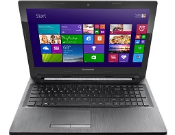
Lenovo G50 laptop with touchpad
Several functions, toolbars, and menus are accessible in Windows 8 by swiping from an edge of the screen. These work well on a touch-screen tablet, but can be counterproductive on a regular computer, particularly a laptop with a touchpad.
Here's why. On a computer with no touch screen, these functions can be accessed by moving the mouse pointer to a corner of the screen. For example, moving the mouse all the way into the top-right or bottom-right corner is the same as a right-edge screen swipe; this reveals the Charms bar on the right edge of the screen. Also, laptops with touchpads designed for Windows 8, with additional software from the touchpad manufacturer, support many or all of the screen swipes you can do on a touch screen. On such laptops, if you swipe in from the right edge of the touchpad, the Charms bar will appear.
The problem is it's very easy to reach for your touchpad intending to move the mouse pointer, and, because the touchpad is generally only a few inches across, accidentally do a right edge swipe. Or, on a desktop, if you happen to move your mouse into a corner, the Charms bar appears, blocking the scroll bar, which is often what you were moving the mouse to use (Microsoft added a delay for the mouse-in-the-corner Charms bar in the April 2014 update to Windows 8.1, specifically to address this).
Also, on some laptops, the touchpad supports extra features, including two- and three-fingered gestures you can easily make by mistake. This can make the Start screen suddenly take over your screen just as you were about to try to click on something in a desktop application, disrupting your train of thought and wasting your time.
These are relatively minor issues, and you can certainly disable the extra touchpad features. But this means either you lose time dealing with the Charms bar or Start screen unexpectedly getting in your way, or having to research how to disable the touchpad gestures (which is different for each computer model). This contributes to the overall sense that you're using the wrong operating system for your desktop or laptop computer.
5. Microsoft hid much of what you use regularly.
They did this to make it easier to use in tablet mode, but it's counterproductive on desktop and laptop computers. This isn't new; in past versions of Windows, Microsoft has chosen to hide things from the user to make a cleaner interface. For Windows 8, the Control Panel and the Printers window were the victims, as well as the Shut Down and Restart functions. Even the Computer icon (called This PC as of Windows 8.1) is only accessible if you click the Libraries icon and spot it in the left pane of the window that opens, or find it in the All Apps section of the Start screen.
Again, Microsoft has addressed this, partially. If you have Windows 8.1 with the April 2014 updates, the Shut Down and Restart functions are now on the Start screen on desktop and laptop computers, and the Control Panel, as described above, is easier to find. And, on a clean install of this updated edition of Windows 8.1, This PC, the Documents folders, and PC Settings appear on the main Start screen.
Final Words
If you've read bubbly articles on other sites about how great the new Windows 8 interface is and wondered why they don't seem to comport with your experience on a desktop or laptop, then hopefully this article has provided some insight into exactly why.
As mentioned above, Microsoft did address some of the initial deficiencies in the Windows 8 user interface with software updates, although the overall design is still a tablet-oriented system for touch screens and therefore problematic for desktops and laptops. There are several third-party software products available that can restore some of the functions of the Start menu to make your computer more like Windows 7, along with many tweaks you can implement yourself, which you can learn about by reading or just by poking around your computer. You expect to have to find add-ons and customize your system to get it to work right if you use free, open-source software. But this is not something you should have to do with paid, commercial software, especially from a company like Microsoft, which has a long history of producing quality software and has set the standard for usability for many years.